How I built passport stamps on Atlas Obscura
Some features are important because they make money.
Some are important because they make the product feel like itself.
Passport stamps were in the second category.
At Atlas Obscura, users could mark places they had visited. That action already existed, but it needed a better payoff. A raw count is fine. A country stamp that turns your travel history into something collectible is better.
What I liked about this feature is that it looks small from the outside and then immediately stops being small once you build it properly.
It needed a visual component for the web profile. It needed backend logic to decide which countries a user had actually earned. And it needed an API shape that the mobile app could use without reimplementing business rules on the client.
That's the kind of product work I enjoy. The UI is the easy part to notice, but the real job is keeping the meaning of the feature consistent everywhere.
 The profile feature that pushed me into UI, query logic, and API contract work at the same time.
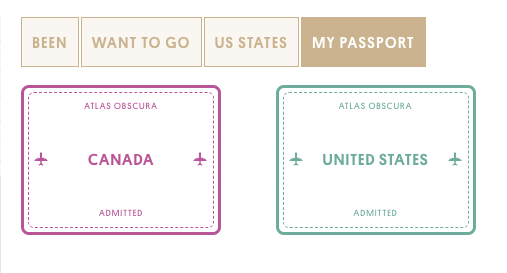
The UI had to feel like a real stamp, not a badge
I built the stamp as a ViewComponent, which was already becoming a better fit for Atlas Obscura's Rails frontend than scattering one-off partial logic all over the place.
The component itself was simple:
class PassportStampComponent < ViewComponent::Base
  include ImageHelper
  attr_reader :country_name, :color

  def initialize(country_name:, color:)
    @country_name = country_name
    @color = color || "#BB5399"
  end
end
That lived in a small ViewComponent class in the Rails app.
What mattered more was the shape of the markup and CSS. I wanted it to read like a passport stamp at a glance, not like another generic card inside a profile page. The template used the country name, a custom icon, and a configurable border color:
<div class="stamp-container" style="border-color: <%= color %>; color: <%= color %>;">
  <div class="stamp-inner-border" style="border-color: <%= color %>;">
    <div class="stamp-header">Atlas Obscura</div>
    <div class="stamp-country-name">
      <%= atlas_svg_icon('passport-plane', style: "fill: #{color};") %>
      <span><%= country_name %></span>
      <%= atlas_svg_icon('passport-plane', style: "fill: #{color};") %>
    </div>
    <div class="stamp-footer">Admitted</div>
  </div>
</div>
That came from the component template and its matching stylesheet.
I like this kind of work because it sits in the middle. It isn't just "make it pretty." The component had to be reusable, previewable, and testable. It also had to survive real profile data where some countries had a configured stamp color and some didn't. That's why the component falls back to a default color instead of making every caller care about that detail.
The real logic was deciding what a user had earned
The harder part was not rendering the stamp.
The harder part was answering a product question in SQL terms: when does a user deserve a country stamp?
At Atlas Obscura, users earned stamps from actual place activity, not from manually selecting countries out of a list. That meant the source of truth had to stay tied to visited places. I pushed that logic into the Geo model:
def self.passport_stamps(user_id)
  joins("LEFT JOIN places on places.country = geos.country")
    .merge(Place.published.joins(:activity_streams)
  .where(activity_streams: {user_id: user_id, kind: 1, streamable_type: "Place"})
  .distinct.unscope(:order)).countries.select(:country, :passport_stamp_color)
end
That logic lived in the Geo model.
That method did a few useful things at once:
- it only considered published places
- it tied eligibility to recorded place activity
- it returned country-level rows, not individual places
- it selected just the fields the UI and API needed
That's the part I care about most in retrospect. Once the rule lives in one place, the rest of the feature gets easier. The web profile doesn't need custom filtering logic. The mobile app doesn't need to guess. If the definition of an earned stamp changes, there's one place to change it.
That's the point.
The API mattered because the feature wasn't just for the website
This is where the feature became more interesting than a profile polish task.
I also added a dedicated API endpoint so the native app could request stamp data directly:
def passport_stamps
  user = User.find(params[:id])
  @stamps = Geo.passport_stamps(user.id)
end
That endpoint lived in the API users controller, and the JSON view stayed intentionally small:
json = @stamps.map do |stamp|
  {
    country_name: stamp.country,
    color: stamp.passport_stamp_color
  }
end
json
The response stayed intentionally narrow.
I like this pattern a lot in Rails apps that are growing beyond the browser.
The mistake is to think the app just needs "the same data." Usually it needs a smaller, cleaner contract. In this case the mobile client didn't need the whole Geo object. It needed a list of stamps with names and colors. Nothing else.
That made the endpoint easier to test and harder to misuse.
It also meant the app team could move without pulling web concerns into native code. That's a quiet win, but a real one.
This is one of my favorite kind of feature work
Passport stamps weren't the biggest thing I built at Atlas Obscura.
They were one of the cleanest examples of end-to-end product engineering.
There was just enough design work to make the feature feel special. And just enough API work to keep web and mobile aligned.